# Uniswap — Style Reference
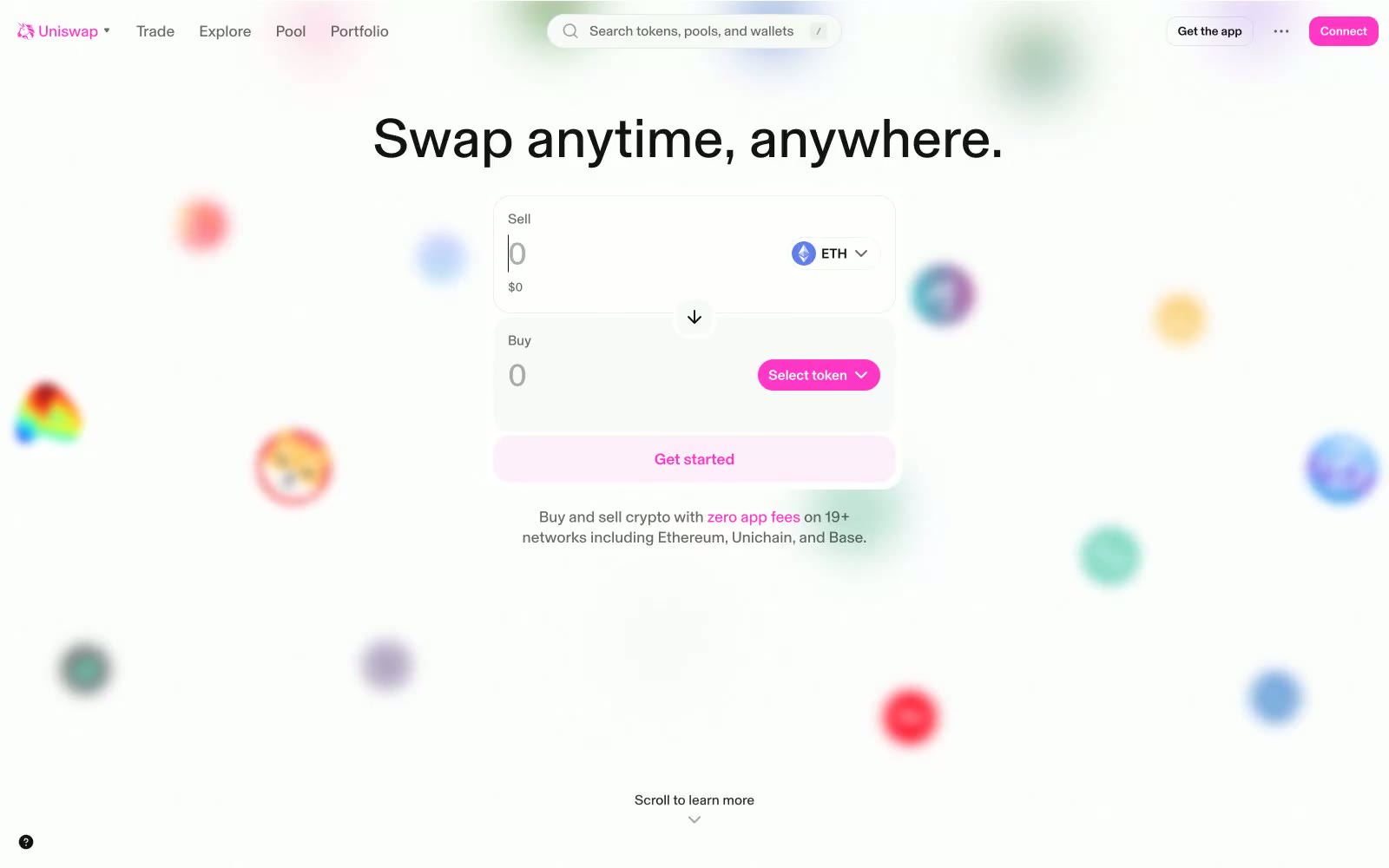
> cotton-candy swap terminal in white air. Vivid magenta accents pierce an otherwise colorless, floating interface, while soft chromatic orbs drift in the background like currency made visible.

**Theme:** light

Source measurements are normalized; roles and recommendations are interpreted. Font summary lists are independent, not paired by position. HTML examples are reconstructions, not source components.

Uniswap presents a light, airy swap terminal aesthetic: a near-white canvas where a single vivid magenta-pink brand color carries every interactive signal, surrounded by soft floating color orbs that lend the page a playful, weightless atmosphere. Typography is confident and tight — a single custom display face (Basel) at near-black weight, with an unusual 485 weight that sits between regular and medium, creating a subtly compressed, modern feel across both display and UI copy. Components stay compact and rounded — 20px radii on swap cards, 16px on buttons, pill shapes for tokens — with barely-there shadows that let the white surface breathe. The overall experience feels like a DeFi command center rendered in pastel air: structured enough to trust with money, colorful enough to feel alive.