# Monzo — Style Reference
> Warm coral on cool mint paper — confident restraint with a single hot accent.

**Theme:** light

Source measurements are normalized; roles and recommendations are interpreted. Font summary lists are independent, not paired by position. HTML examples are reconstructions, not source components.

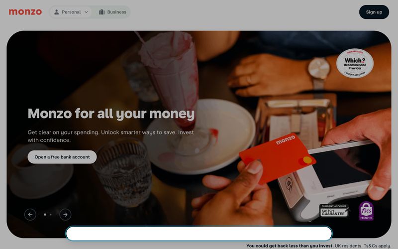
Monzo operates as a digital-first challenger bank with a light, warm, and unapologetically friendly visual language. The canvas is a whisper-soft mint off-white (#f2f8f3) that sits behind crisp white card surfaces, creating a layered paper-on-paper feel without relying on heavy shadows. A single vivid Hot Coral (#ff4f40) carries all chromatic energy — it stains the logo, links, headings, icons, and the physical card product itself, while the rest of the interface stays achromatic and quiet. Typography is custom sans-serif in two voices: a text family with a distinctive negative letter-spacing of -0.05em that tightens paragraphs, and a chunky display face at 600-800 weight for headings. Components are generously rounded (pills for actions, 64px for containers) and deliberately low-elevation — the brand trusts color, type weight, and whitespace to create hierarchy, not drop shadows.