# Somos incansáveis pra você não precisar ser | Nubank — Style Reference
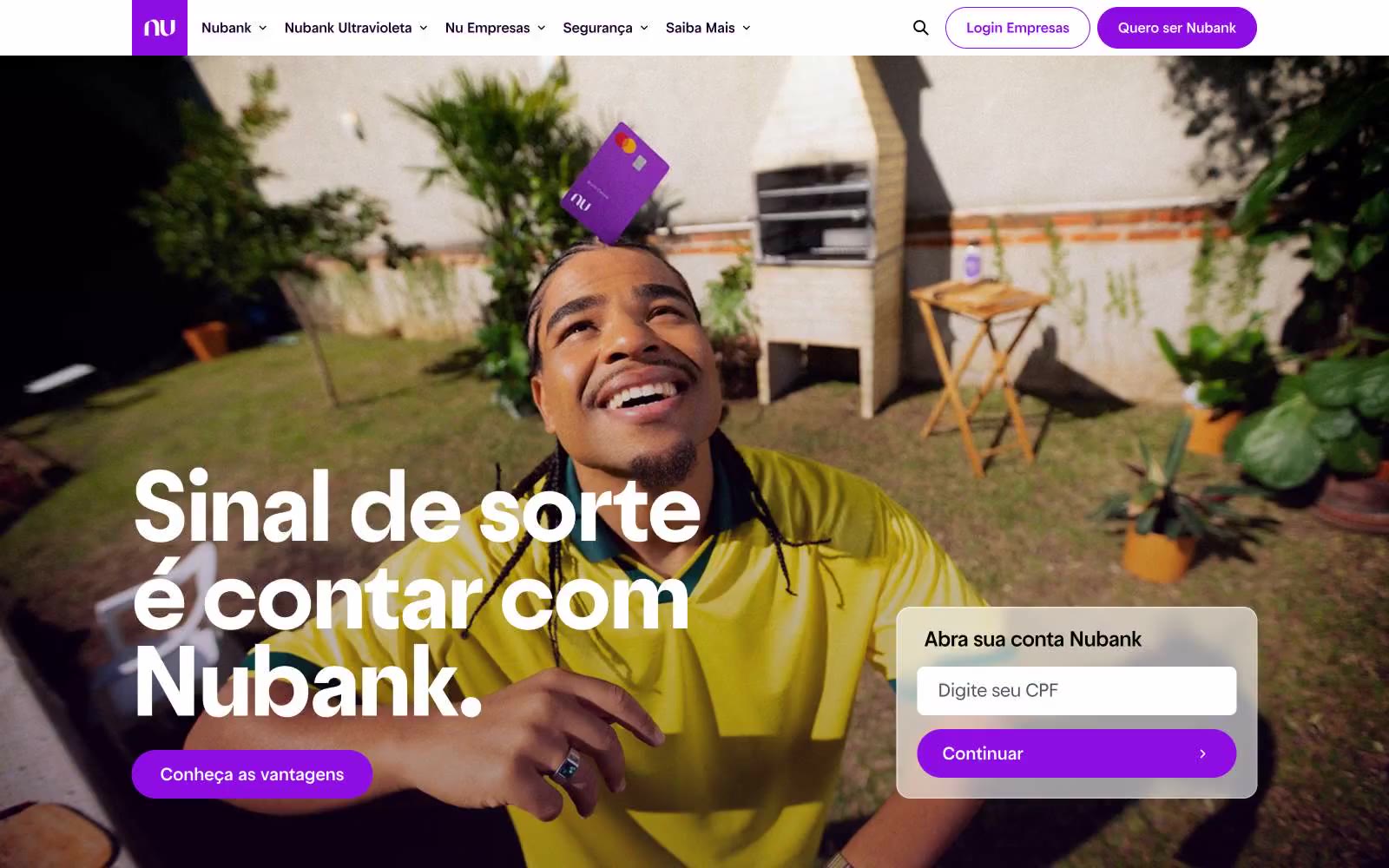
> Violet signal on white marble — one vivid accent on luminous off-white, all surfaces curved into soft pills.

**Theme:** mixed

Source measurements are normalized; roles and recommendations are interpreted. Font summary lists are independent, not paired by position. HTML examples are reconstructions, not source components.

Nubank operates on a radical one-accent system: a white porcelain canvas, black ink typography, and a single vivid violet that functions as the only chromatic note in the entire interface. The visual grammar is built on pill shapes — buttons, inputs, and links all curve into 999px capsules, giving the system a soft, rounded, approachable personality that softens the severity of high-contrast black-on-white. Typography carries the authority: a custom geometric sans (Graphik) at weights 400-500 with aggressive negative tracking, creating tight, composed headlines that whisper rather than shout. The page breathes — generous 8px-based spacing, large display sizes (up to 56px), and dark photo sections that contrast with otherwise luminous white surfaces. Every interaction surface is a pill, every accent is violet, and every screen feels like a single page from a meticulously typeset magazine.