# ethereum.org — Style Reference
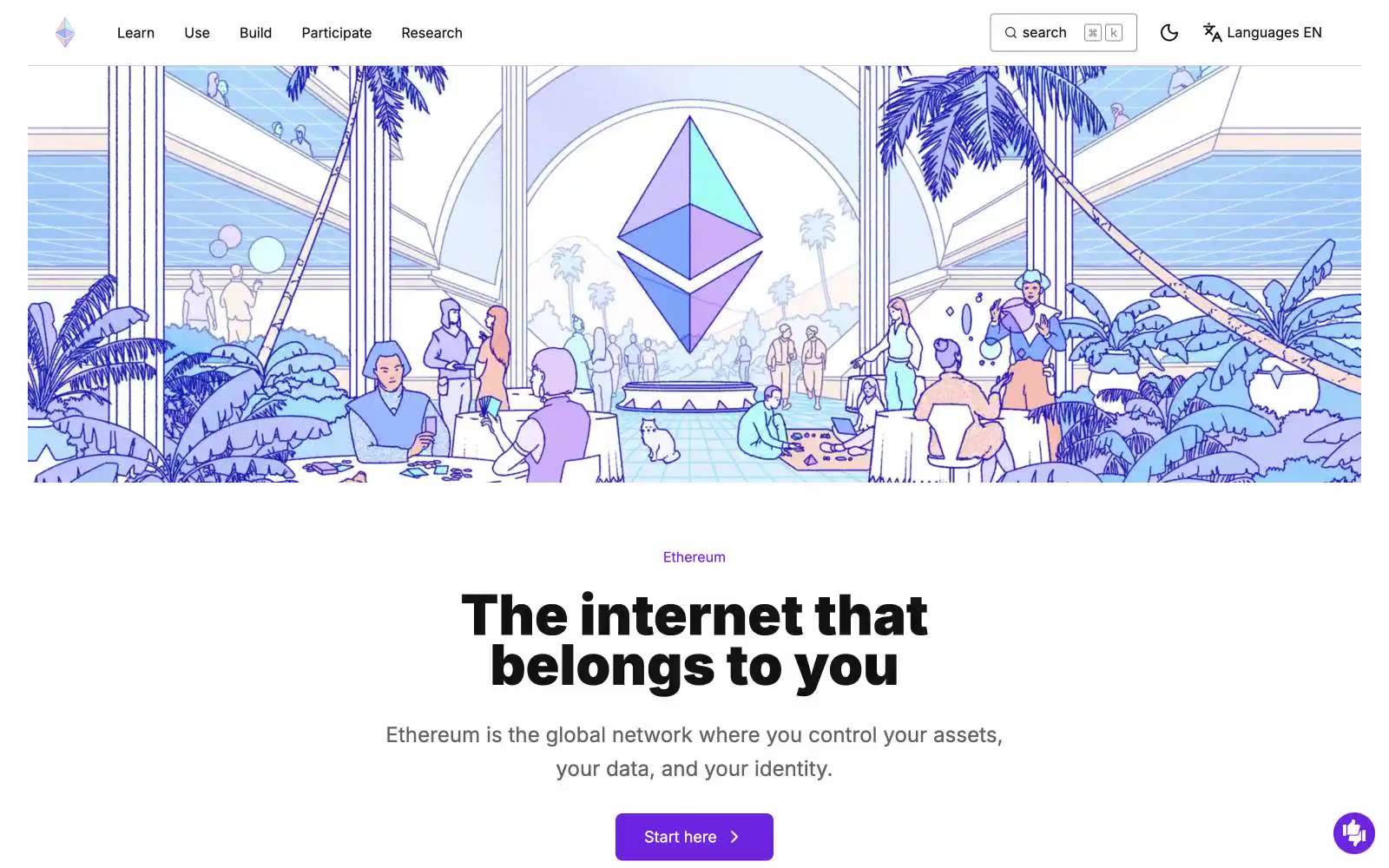
> Lilac architecture in flat editorial space — a printed open-source almanac where the Ethereum diamond floats above duotone crowds of people.

**Theme:** light

Source measurements are normalized; roles and recommendations are interpreted. Font summary lists are independent, not paired by position. HTML examples are reconstructions, not source components.

Ethereum.org is a bright, illustration-driven editorial site for a decentralized ecosystem: white-and-lilac surfaces, bold Inter 900 display type, and full-bleed duotone line-art scenes that make the brand feel like a printed almanac rather than a product dashboard. Color is rationed — the dominant lavender wash (#ece0ff) reads as paper, while a single vivid violet (#6c24e0) owns every primary action, eyebrow label, and link, keeping the interface calm between dense content blocks. Feature content sits on flat pastel cards (lavender, mint, peach, pink) with 16px corners, no shadows — elevation is expressed through surface tint, not depth. Components are square-shouldered (4–8px button radius) and lightweight, the Ethereum diamond octahedron recurs as the only consistent iconographic mark, and the visual rhythm alternates between wide illustrated bands and tight typographic grids.