# Henry — Style Reference
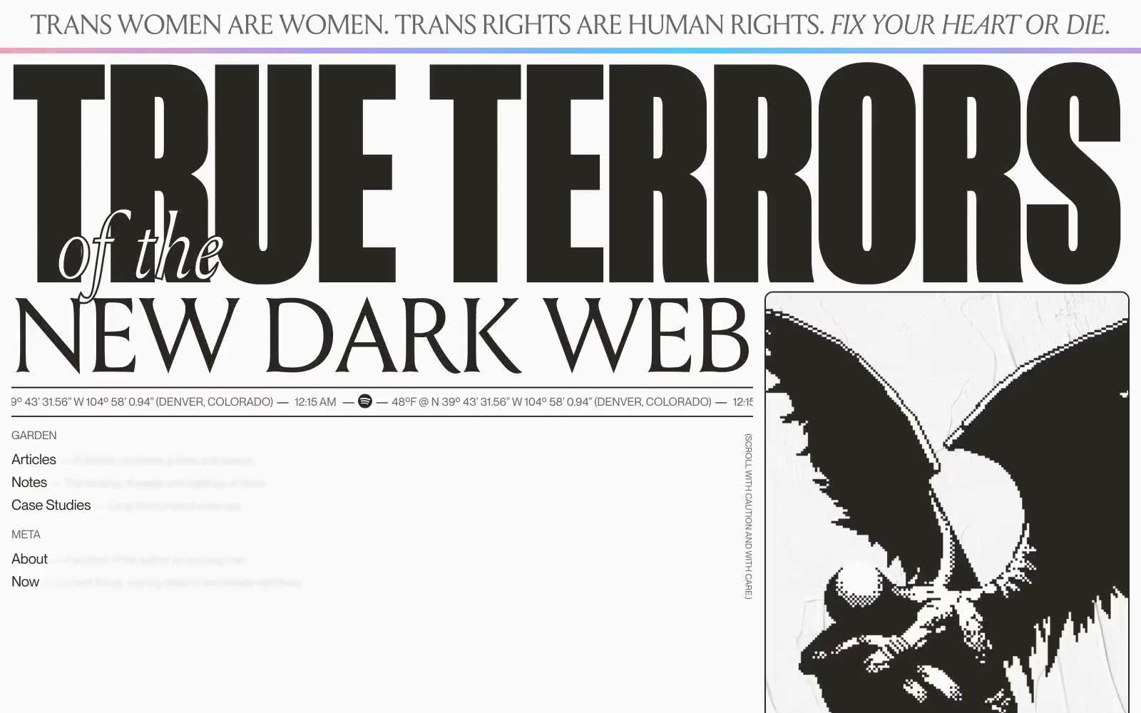
> Gothic broadside poster on warm cream paper. One hundred percent monochrome, no chromatic accent, all visual intensity carried by display type and full-bleed paper-to-ink inversions.

**Theme:** mixed

Source measurements are normalized; roles and recommendations are interpreted. Font summary lists are independent, not paired by position. HTML examples are reconstructions, not source components.

Henry Codes reads like an editorial broadside printed in warm ink: near-black headlines carved into cream paper, alternating with full-bleed dark sections where cream serif type glows. The palette is one-hundred-percent warm monochrome — no chromatic accent, no product color, no blue link — every visual move comes from scale, weight, and inversion. Type is the brand: a display serif (Louize) sets poetry and editorial prose, a condensed display sans (Manuka) stamps section headers at 200–370px, and a neo-grotesque (Neue Montreal) carries all UI at 12–24px. The spacing system is austere: 4–32px increments, one radius (12px), no shadows. Sections flip between paper and ink like a broadsheet newspaper, and most screens should be dominated by two or three enormous words rather than illustrated product art.