# SuperMush — Style Reference
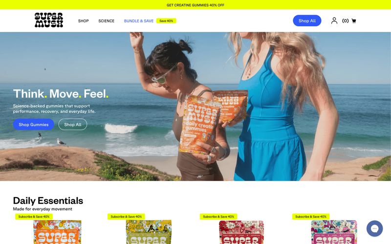
> Sun-bleached skate ramp meets wellness billboard. Warm bone canvas, one electric blue action color, and full-bleed lifestyle photography that does the shouting.

**Theme:** light

Source measurements are normalized; roles and recommendations are interpreted. Font summary lists are independent, not paired by position. HTML examples are reconstructions, not source components.

SuperMush runs on a sun-drenched DTC wellness playbook: a warm bone canvas, electric cobalt as the singular action color, and a tri-color accent system (cobalt, ember orange, volt lime) that shouts without cluttering. Layout breathes between quiet white product grids and explosive full-bleed lifestyle photography, with colored bands — a lime promo bar up top, an orange retailer strip in the middle — acting as visual exclamation points. Typography is geometric and confident, leaning on tight line-heights at large sizes so headlines feel like stickers slapped onto the page rather than typed paragraphs. Components are flat and pill-shaped; the 50px button radius and near-total absence of shadows produce a tactile, high-energy feel that mirrors the packaging itself, and the orange product body color is allowed to bleed into the brand skin (retailer bar, sale flags) without ever crossing into button territory.