# Studio Emmerer — Style Reference
> Typeset on drafting paper

**Theme:** light

Source measurements are normalized; roles and recommendations are interpreted. Font summary lists are independent, not paired by position. HTML examples are reconstructions, not source components.

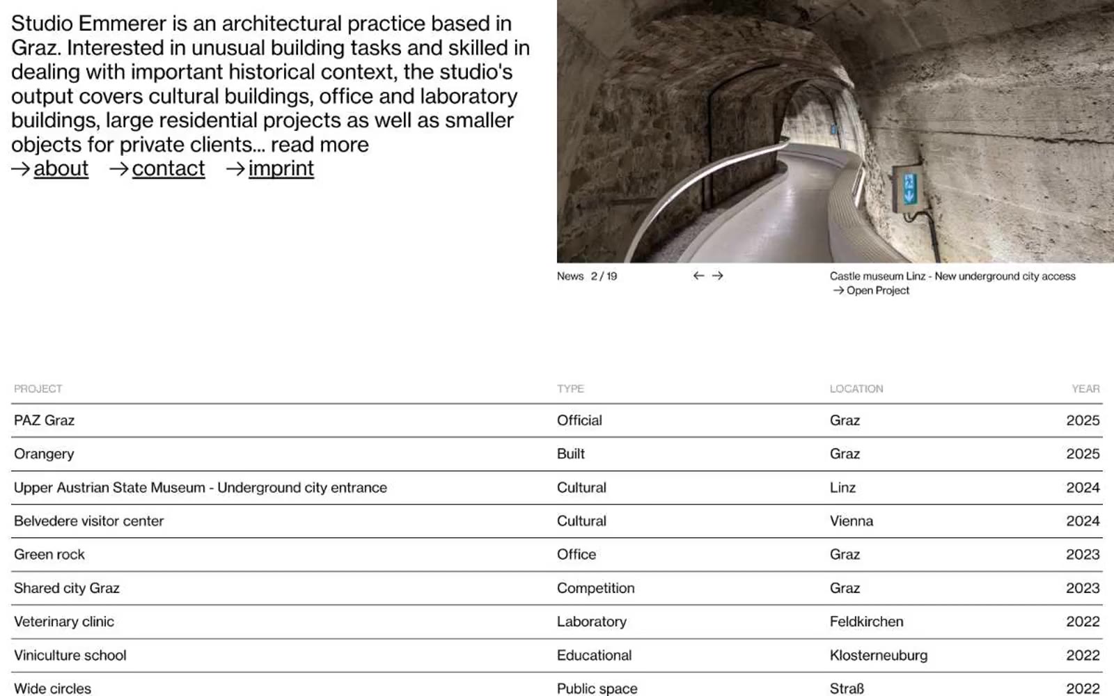
Studio Emmerer presents itself as typed content first, photography second — a two-tone document where NHaasGrotesk weight 400 carries every word at 16px or 30px, with tight 0.90–1.16 line-heights and negative tracking at every size. The palette is strictly black, white, and a single mid-gray (#999999) reserved for table column headers; there are no fills, no shadows, no rounded corners, no decorative graphics of any kind. A flat project table dominates the page — 1px black row dividers, 12px vertical padding, edge to edge with no card containers wrapping the rows. The right-arrow glyph (→) is the only interactive ornament, prefixing inline underlined links for both site navigation and individual project entries. Everything else is whitespace and type: the layout reads like a printed catalogue spread, not a software interface.