# Liquid Death — Style Reference
> Heavy Metal Vending Machine

**Theme:** mixed

Source measurements are normalized; roles and recommendations are interpreted. Font summary lists are independent, not paired by position. HTML examples are reconstructions, not source components.

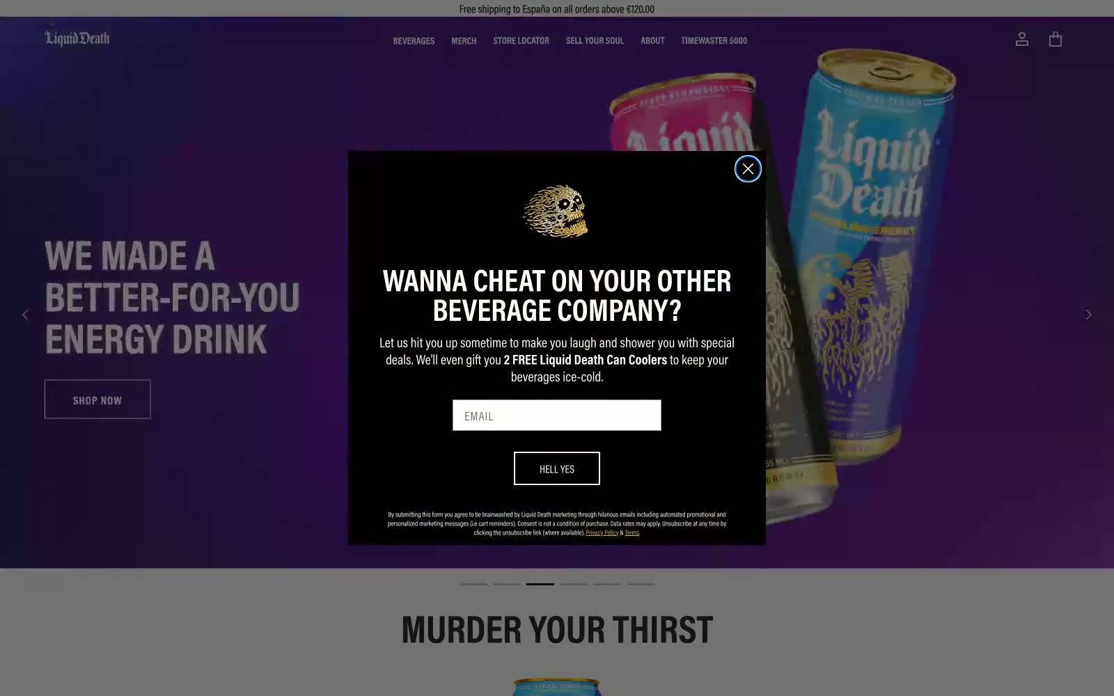
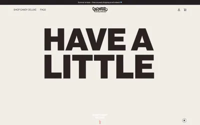
This design system feels like a heavy metal concert flyer brought to life as a direct-to-consumer brand. The aesthetic is built on brutalist principles: a stark palette of pure black and white, zero rounded corners, and aggressive, uppercase typography. This creates a hard, confrontational edge, deliberately rejecting the soft, approachable look of typical beverage companies. Splashes of antique gold in logos and links are the only moments of warmth, acting like a glint of metal on a matte black surface. The layout uses full-bleed, high-contrast sections, creating a jarring, powerful rhythm that mirrors the brand's 'Murder Your Thirst' tagline.